rearranging the living room

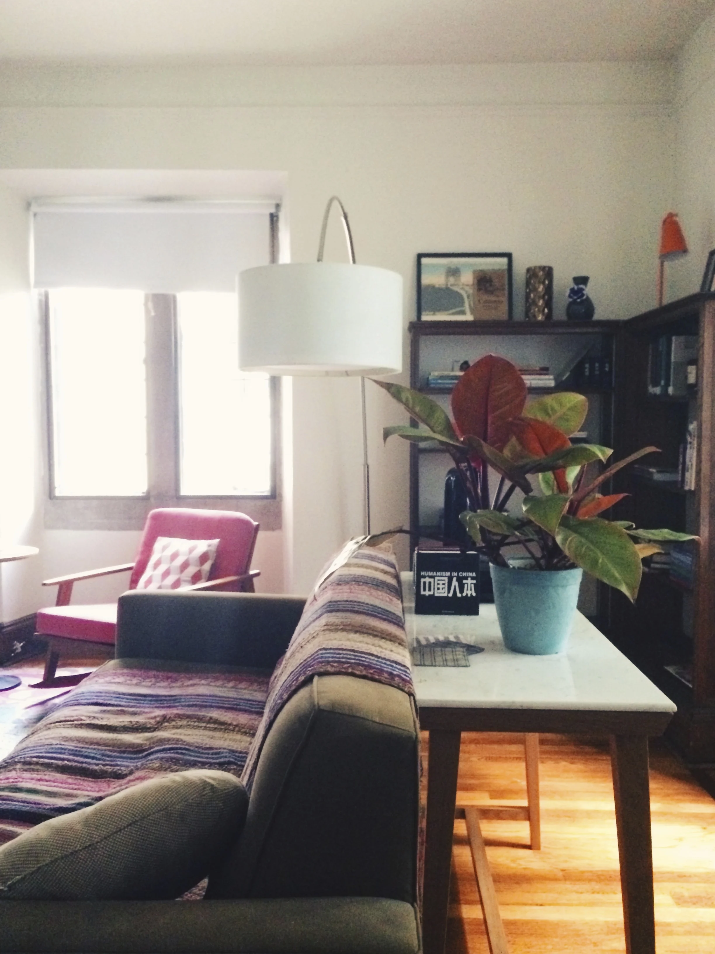
as you may or may not know, we recently had a leak in our living room that damaged the floors. this necessitated a move, plumbers, hvac technicians, and finally, new maple planks. after weeks (unbearably long when you are already very pregnant and wanting to hang nursery prints rather than deal with stripped concrete floors), we are finally moving everything back this week. hhh and i contemplated a new arrangement for the living room, but i'm not totally sold on it. here are some photos: 

image.jpg
image.jpg
image.jpg

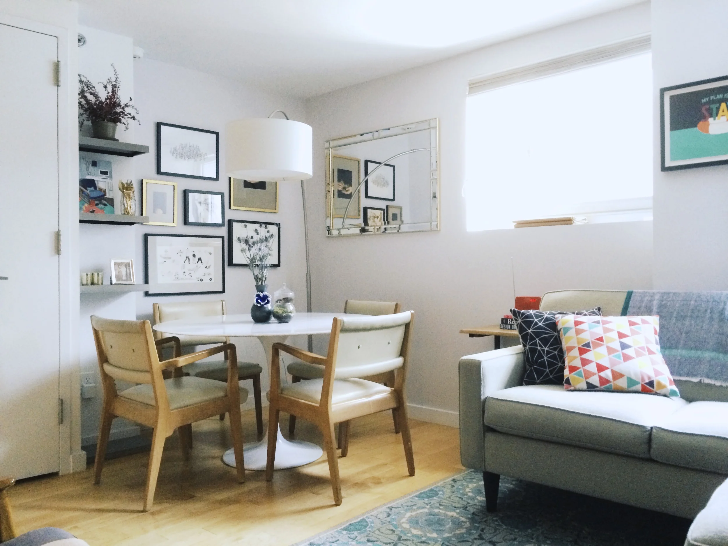
just as a reminder, this is what it used to look like: 

dining-nook-old
living-room

what do you think? should we stick with the tried-and-true or embrace the change? 

away in poughkeepsie

it got to be too much for hhh to commute back and forth to work (it's about 85 miles each way), so we decided to get a place on campus. we now have a cozy little one-bedroom where we can all stay. willa is super happy about that, since her love of vassar grass knows no bounds. this love is communicated through howling and incessant barking anytime we are within poughkeepsie city limits ("why can't we be outside ALL THE TIME?" she wants to know), which has probably (definitely) made us the bane of our neighbor's existence. 

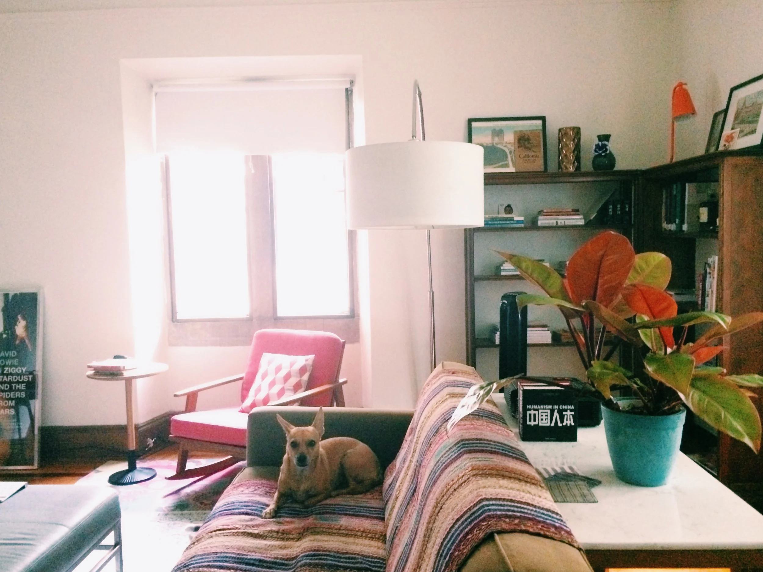
a view towards the back of the room. the sofa came from our home office and faces a really lovely but non-working fireplace.

a view towards the back of the room. the sofa came from our home office and faces a really lovely but non-working fireplace.

we moved up a few weeks ago, and the place is coming together. i'm of the belief that one should unpack ASAP, i.e., on the day you move. (boxes are the worst.)  we were able to bring a lot of the furniture from carroll street, and got a couple things from a friend's moving sale. that plus a trip to the poughkeepsie target (leaps beyond than the one at atlantic terminal...it's like they aren't even the same store) has us pretty much set up. the only thing left to do is to hang the photos! 

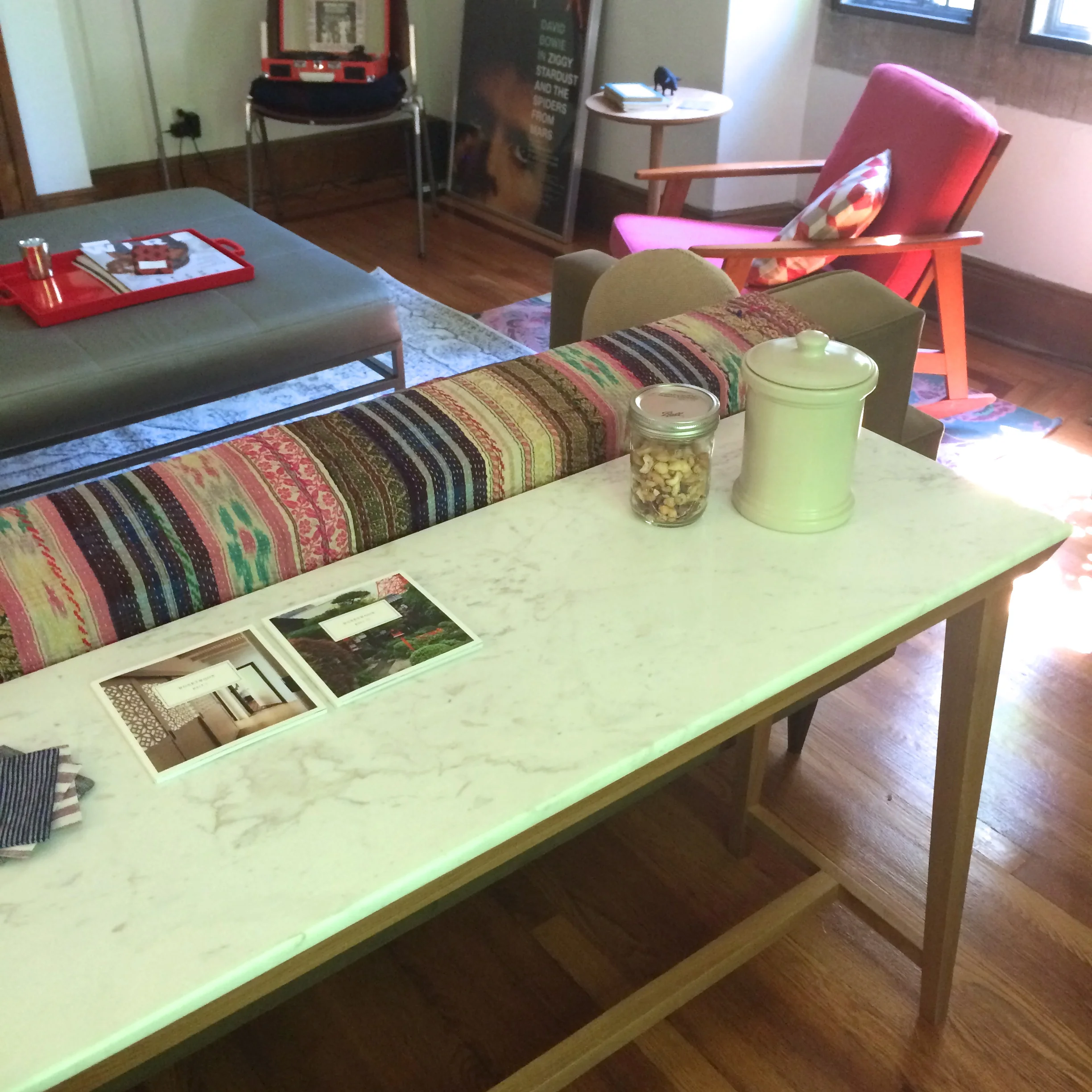
i am incredibly excited about this conran console, which came from a clearance sale at jcpenny's. 

i am incredibly excited about this conran console, which came from a clearance sale at jcpenny's. 

i was actually going for a minimalist look, but have had to resign myself to being just an aspiring minimalist (as long as i live with hhh anyway. he loves his clutter.).

i was actually going for a minimalist look, but have had to resign myself to being just an aspiring minimalist (as long as i live with hhh anyway. he loves his clutter.).

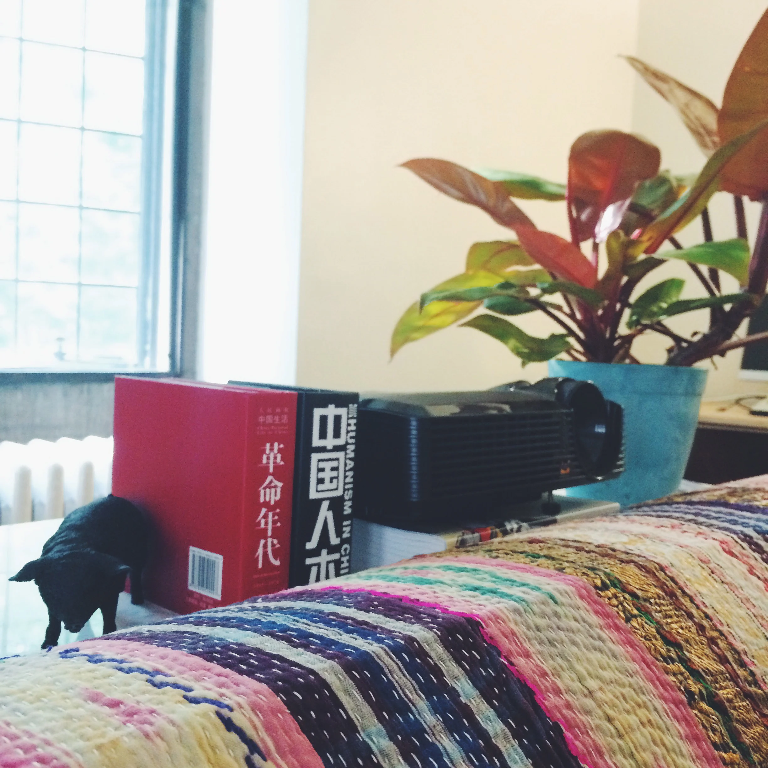
a little black pig, some books, a projector (aka tv!), a philodendron. 

a little black pig, some books, a projector (aka tv!), a philodendron. 

this is phil the philodendron. we got him at the greenhouse at adam's fairacre farms.

this is phil the philodendron. we got him at the greenhouse at adam's fairacre farms.

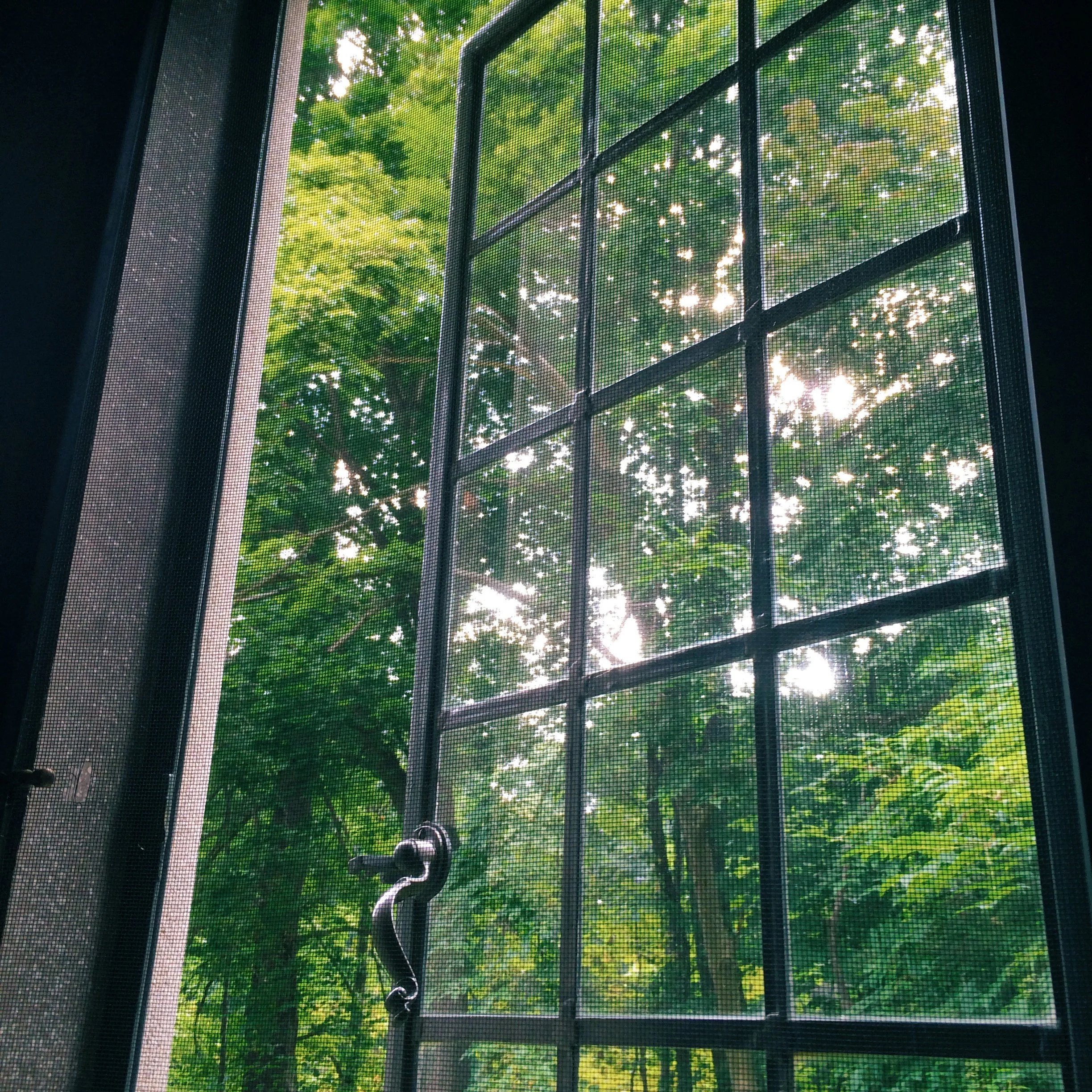
these cast iron windows are beautiful but don't really keep out the bugs. it's still a lovely view of trees and the lake.

these cast iron windows are beautiful but don't really keep out the bugs. it's still a lovely view of trees and the lake.

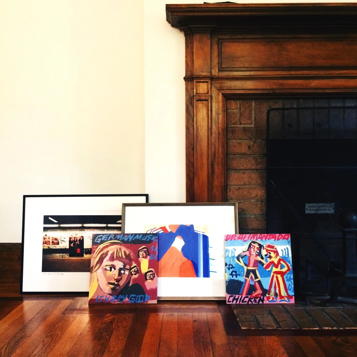
art, which has yet to go up. and the fireplace! grafitti by jon naar, "despair" by yuji yamada.

art, which has yet to go up. and the fireplace! grafitti by jon naar, "despair" by yuji yamada.

willa is sulking because i am taking photos of the apartment instead of romping through the great outdoors with her.

willa is sulking because i am taking photos of the apartment instead of romping through the great outdoors with her.

that's it for now. i'll be back eventually with the bedroom and kitchen. xoxo

a gallery wall

this wall's been up a while, but since i'm thinking of changing it around, i thought i'd document it first. the light in the living room isn't the greatest, but here we go.

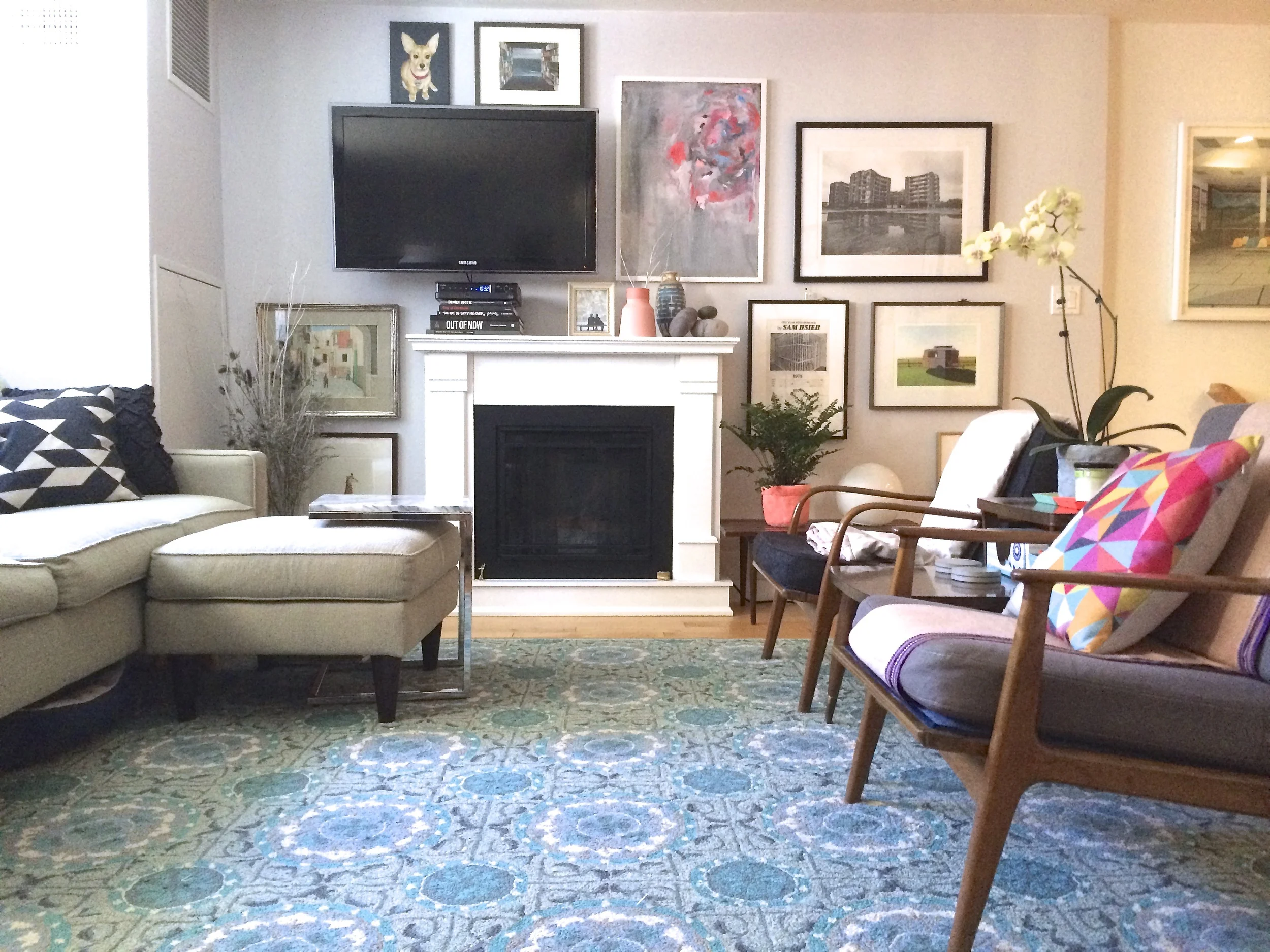
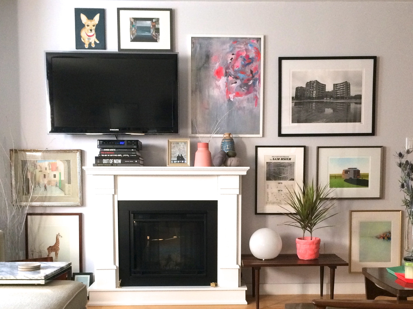
clockwise from the dog portrait: willa by nicole chen, library by the sea by jeremy miranda, swirling planes by kristin endsley, a french banlieue by jr, one year performance by hsieh tehching, ariba familia by leah giberson, abstract land…

clockwise from the dog portrait: willa by nicole chen, library by the sea by jeremy miranda, swirling planes by kristin endsley, a french banlieue by jr, one year performance by hsieh tehchingariba familia by leah giberson, abstract landscape by yang yang; baby giraffe by sharon montrose, boys playing soccer (found at the ps321 brooklyn flea). 

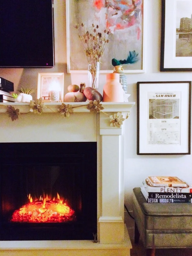
the two-tone peach vase came from culture + commerce project in hudson, ny; the blue vase is an "antique" from panjiayuan market in beijing; the felted stones are from the art institute of chicago's gift shop.

the two-tone peach vase came from culture + commerce project in hudson, ny; the blue vase is an "antique" from panjiayuan market in beijing; the felted stones are from the art institute of chicago's gift shop.

the orb lamp is from ikea, and the neon orange crinkle planter is from cb2. 

the orb lamp is from ikea, and the neon orange crinkle planter is from cb2. 

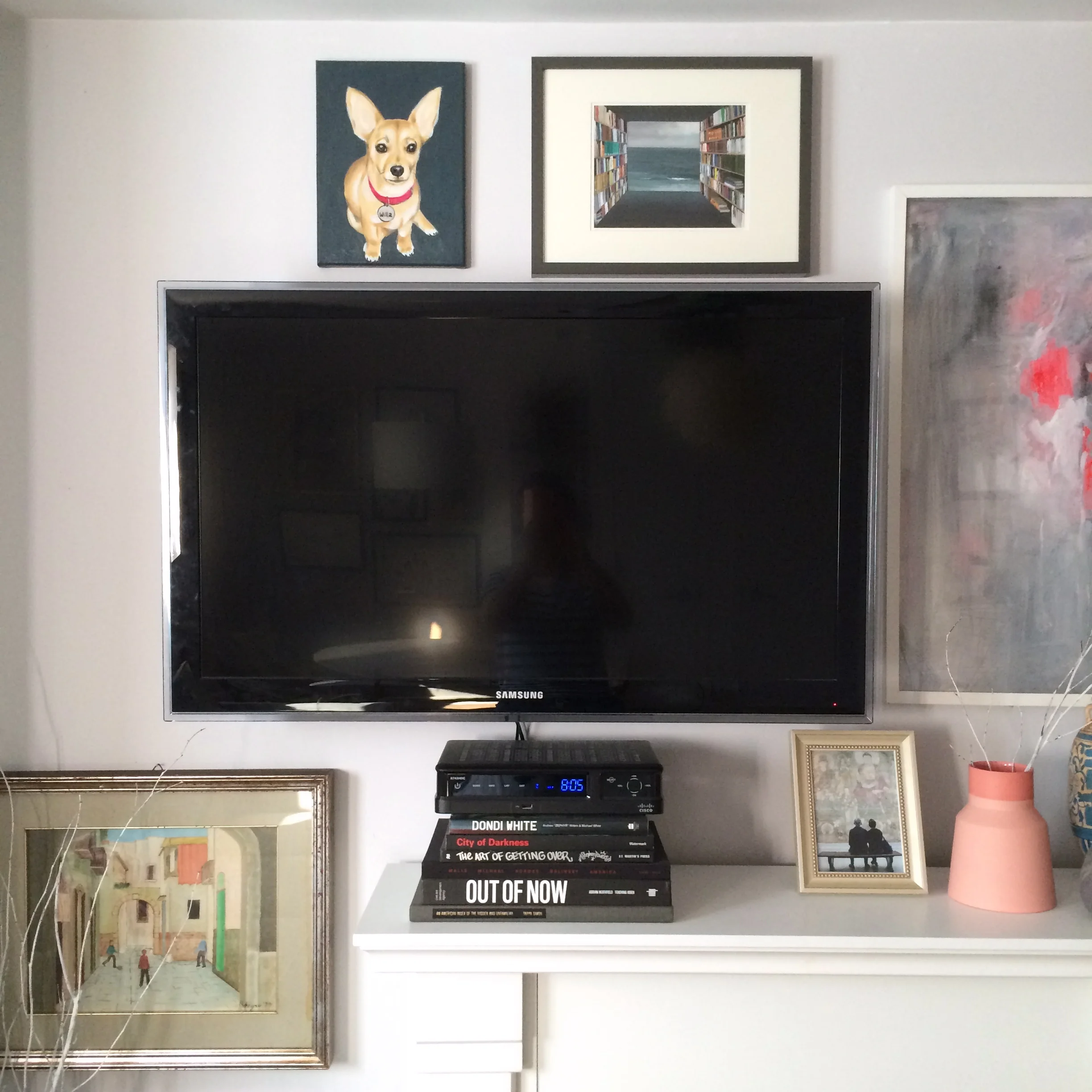
the whole point of the gallery wall is to camouflage the tv. did it work? the stack of books holds the cable box and masks the cables, which drop down behind the fireplace. 

the whole point of the gallery wall is to camouflage the tv. did it work? the stack of books holds the cable box and masks the cables, which drop down behind the fireplace. 

another view, with one of our pair of danish modern chairs in the foreground. the geometric pillow is linen and made in hong kong.

another view, with one of our pair of danish modern chairs in the foreground. the geometric pillow is linen and made in hong kong.

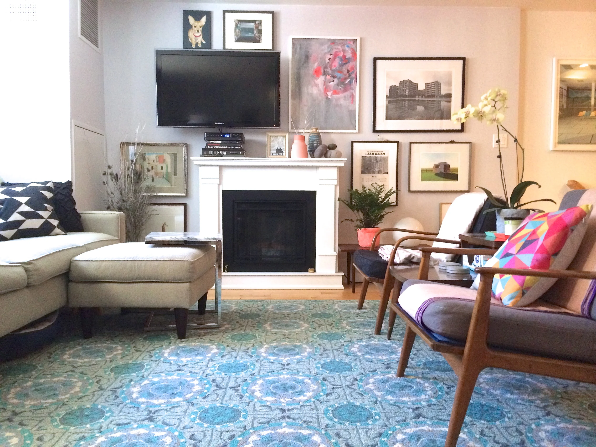
a wider shot of the gallery wall plus the furniture. this photo is from a while back, so there are different plants in the photo. :) 

a wider shot of the gallery wall plus the furniture. this photo is from a while back, so there are different plants in the photo. :) 

what do you think? let me tell you, i thought about this wall a lot. mostly it happened last year, while i was watching castle on hulu on those cold beijing winter nights, dreaming about going home to brooklyn. it was the first project i tackled after getting home, although to be fair, hhh had already gotten it started by putting together that a-mazing electric fireplace i got on overstock. that thing has an incredible hologram-ish logs and flame display. it flickers. it dims. it produces a totally adequate amount of heat. i love it. 

so the fireplace and the tv were the two things that i had to include on the wall, and i was dead set on not centering the tv over the fireplace. most people thought this was crazy, but i think that it turned out nicely. (you better agree, because i hung that damn tv myself and am not moving it. ever.) anyway, i think went with two other similarly-sized pieces along the same sight line in order to balance it out. the organic shape of the gallery wall is nice for now, although i think it could probably be filled in down the line with new pieces. maybe something sculptural, or something with an air plant in it! 

anyhow, that's the gallery tv wall. xoxo